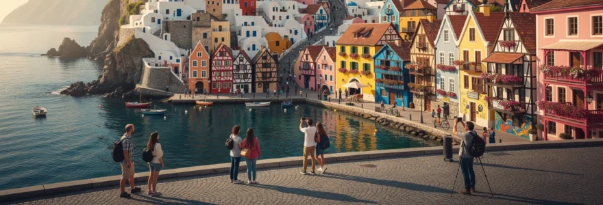
Across the globe, certain settlements transcend ordinary architecture through their extraordinary chromatic displays, creating environments that appear almost fantastical to visitors. These vibrant communities represent more than mere aesthetic choices—they embody cultural heritage, practical adaptations to local climates, and deliberate urban planning decisions that have transformed mundane streetscapes into breathtaking visual experiences. From Mediterranean fishing villages painted in azure blues to South American colonial towns adorned with brilliant yellows and reds, these chromatic settlements challenge conventional notions of urban design whilst attracting millions of tourists annually.
The psychological impact of colour in built environments cannot be understated, with research consistently demonstrating how specific hues influence mood, behaviour, and even economic activity within communities. Vibrant architectural palettes serve multiple functions: they aid navigation in complex urban layouts, reflect local cultural traditions, protect buildings from harsh weather conditions, and create distinctive place identities that support tourism economies. Understanding the historical, cultural, and practical reasons behind these chromatic choices reveals fascinating insights into human settlement patterns and community identity formation.
Mediterranean chromatic architecture: santorini’s Blue-Domed villages and cinque terre’s pastel coastlines
The Mediterranean basin showcases some of the world’s most iconic chromatic architecture, where centuries of maritime culture have shaped distinctive colour palettes that reflect both practical necessity and aesthetic preference. These coastal settlements demonstrate how environmental factors, cultural traditions, and tourism development can combine to create architecturally significant chromatic landscapes that feel otherworldly to contemporary visitors.
Santorini’s cycladic White-and-Blue aesthetic in oia and fira
Santorini’s distinctive white-washed buildings with brilliant blue accents represent one of the world’s most recognisable architectural colour schemes, deeply rooted in both practical necessity and cultural symbolism. The predominant white limestone-based paint reflects the intense Aegean sunlight whilst keeping interiors cool during scorching summer months, while the blue elements traditionally represented the sea and sky in Greek Orthodox religious symbolism. Traditional lime-based pigments used in Cycladic architecture possess natural antimicrobial properties, helping preserve building surfaces in the harsh Mediterranean climate.
The villages of Oia and Fira showcase different applications of this chromatic tradition, with Oia featuring more varied blue tones across its cave houses carved into volcanic rock, whilst Fira maintains stricter adherence to the classic white-blue combination. Modern tourism pressures have led to increased regulation of colour schemes to preserve the islands’ iconic appearance, with local authorities now requiring specific paint formulations that maintain historical authenticity whilst meeting contemporary building standards.
Cinque terre’s vernacular polychromatic building traditions in monterosso and vernazza
The five villages of Cinque Terre demonstrate how vernacular polychromatic traditions evolved from practical fishing community needs into one of Italy’s most photographed architectural landscapes. Each village developed slightly different colour palettes based on available local pigments and family traditions, with Monterosso favouring warmer ochres and terracottas whilst Vernazza displays more varied pastels including distinctive yellows and pinks.
Historical records indicate that these bright colours served multiple practical purposes: they helped fishermen identify their homes from the sea, created psychological warmth during harsh winter months, and utilised locally available mineral pigments that provided weather protection. The UNESCO World Heritage designation has necessitated careful colour regulation, with restoration projects now requiring historical paint analysis to ensure authentic reproduction of traditional hues whilst accommodating modern building requirements.
Mykonos cubic architecture and traditional Lime-Based pigmentation techniques
Mykonos exemplifies how traditional lime-based pigmentation techniques created architecture that appears almost surreal in its geometric simplicity and chromatic purity. The island’s distinctive cubic buildings, painted exclusively in brilliant white with occasional blue or red accents, represent centuries of refinement in both architectural form and colour application. Lime mortar mixed with local volcanic sand creates the characteristic smooth surfaces that reflect light with such intensity that buildings appear to glow against the deep blue Aegean backdrop.
Traditional pigmentation techniques involved multiple layers of lime-based paint applied seasonally, with residents maintaining their buildings through community-organised painting sessions that reinforced
community bonds. These collective maintenance rituals transformed simple whitewashing into a social event, reinforcing both neighbourhood cohesion and the island’s consistent chromatic identity. Today, strict local regulations still govern which colours may be used on doors, shutters, and church domes, ensuring that contemporary renovations and boutique hotels align with traditional Cycladic aesthetics rather than diluting them with incompatible modern palettes.
For visitors, Mykonos’s cubic architecture and intense whiteness can feel almost like walking through a minimalist art installation rather than a functioning town. Photographers must often adapt their techniques to handle the high contrast between blinding white walls and deep shadows, especially during midday. Early morning and late afternoon light reveal subtle tonal variations in the lime-washed surfaces, highlighting brush strokes and repairs that testify to generations of patient upkeep. By understanding how these traditional lime-based techniques work with natural light, you can better plan your own photographic compositions and walking routes through the town’s narrow lanes.
Procida island’s terra cotta and ochre maritime settlement patterns
In contrast to the stark whites of the Cyclades, Procida Island near Naples presents a warm, almost cinematic palette of terra cottas, ochres, and soft pastels. The fishing village of Marina Corricella is particularly renowned for its stacked houses in shades of peach, apricot, lemon, and coral, creating a chromatic tapestry that cascades down toward the harbour. Historically, these colours emerged from practical considerations: builders used mineral pigments mixed into lime-based plaster, drawing from iron-rich clays and volcanic soils that naturally produced earthy hues. The result is a townscape that feels both sun-drenched and intimate, like a painted theatre backdrop come to life.
Procida’s settlement pattern reflects its working maritime heritage, with narrow alleys and vertically organised homes that maximised limited coastal space while giving fishermen clear sightlines to the sea. Colour became an informal coding system, helping returning sailors identify their homes and family workshops from offshore, much like the bright facades of Cinque Terre. In recent years, Procida’s selection as Italy’s Capital of Culture has accelerated restoration efforts that prioritise authentic pigments and traditional rendering methods to preserve its unique chromatic character. For travellers seeking colorful towns around the world that feel almost unreal, Procida offers an immersive experience that remains less commercialised than better-known Mediterranean destinations.
Northern european Timber-Framed chromatic settlements and UNESCO heritage sites
Moving north from the sunlit Mediterranean, Europe’s timber-framed towns demonstrate a very different approach to chromatic architecture. Instead of lime-washed cubes and pastel fishing villages, we find steep gables, exposed structural timbers, and painted infill panels that trace their origins to medieval construction techniques. These half-timbered and wooden settlements show how colour could be used to articulate structural rhythm, signify wealth, and protect vulnerable materials from damp climates. Many of these colourful old towns are now protected as UNESCO World Heritage Sites or designated conservation areas, reflecting their global significance.
In Northern Europe, colour choices were often constrained by the availability of pigments and the need to protect wood from rot, yet builders still found ways to create visually striking streetscapes. Ochres, deep reds, forest greens, and muted blues appear repeatedly, forming a distinctive palette that harmonises with cloudy skies and changing seasonal light. As you explore these historic centres, you can read centuries of urban development through their chromatic layers, from medieval trade routes to Romantic-era restorations and contemporary heritage management strategies. These settlements remind us that vibrant townscapes are not limited to sunny climates; they can flourish even in cool, rainy regions with careful material choices and maintenance.
Bergen’s bryggen hanseatic wooden warehouses and historic preservation methods
Bryggen, the historic harbour district of Bergen in Norway, offers a vivid example of how colour and commerce intertwined in medieval port cities. The row of narrow wooden warehouses, painted in saturated reds, yellows, and earthy browns, once housed German Hanseatic merchants who dominated North Sea trade. Their chromatic uniformity from a distance gives way to subtle variation up close, where different shades reveal successive restoration campaigns and paint technologies. Wooden cladding, vulnerable to rain and salt-laden winds, required protective coatings that gradually evolved from tar-based finishes to modern breathable paints that mimic historical tones.
Preserving Bryggen’s chromatic character presents significant technical challenges, given the site’s status as a UNESCO World Heritage property and its exposure to harsh coastal weather. Conservation teams regularly monitor moisture levels, fungal growth, and ultraviolet damage, adjusting maintenance schedules and paint formulations accordingly. When you walk through these narrow alleyways today, you are seeing the result of decades of interdisciplinary collaboration between historians, architects, and conservation scientists. The bright facades may appear deceptively simple, but behind each coat of paint lies a complex strategy to balance tourist appeal, structural safety, and archaeological integrity.
Rothenburg ob der tauber’s medieval Half-Timbered fachwerk construction
Rothenburg ob der Tauber in Germany is often described as a real-life storybook town, largely due to its impeccably preserved Fachwerk (half-timbered) houses. Here, colour plays a crucial role in articulating the dark timber frames against pastel infill panels in creams, soft greens, and muted reds. Historically, the exposed beams were structural, while the spaces between were filled with wattle and daub or brick, then plastered and painted. Pigments derived from iron oxides and limewash created warm, earthy tones that weathered gracefully over time, contributing to the town’s romantic atmosphere.
Modern visitors may not realise that much of Rothenburg’s chromatic unity is the result of strict heritage guidelines that regulate everything from façade colours to signage materials. After significant wartime damage, reconstruction efforts in the mid-20th century aimed not only to restore the urban fabric but also to recapture the town’s perceived medieval chromatic identity. This involved extensive archival research and paint stratigraphy studies to identify historically documented hues. For travellers interested in how colorful medieval towns are preserved today, Rothenburg offers a case study in how carefully curated colour can evoke a sense of continuity with the past while accommodating contemporary life.
Hallstatt’s alpine lakeside baroque and gothic architectural polychromy
Hallstatt in Austria, perched between a glacial lake and steep mountains, demonstrates how colour can soften and humanise dramatic alpine landscapes. The town’s wooden houses and masonry buildings exhibit a mix of Baroque and Gothic influences, enhanced by painted window frames, decorative shutters, and floral motifs. Facades range from creamy yellows to dusky pinks and light blues, punctuated by dark wooden balconies overflowing with flowers. This layered polychromy creates a dreamlike effect, especially when reflected in the mirror-like surface of Hallstätter See.
The chromatic architecture of Hallstatt evolved in response to both climatic constraints and local building traditions tied to the salt mining industry. Wooden elements needed regular treatment to withstand moisture and freeze-thaw cycles, leading to periodic repainting that subtly altered the town’s overall colour balance over time. Recent surges in tourism, particularly from visitors drawn by social media images of the “fairytale village,” have prompted local authorities to revisit preservation strategies and visitor management. When we photograph Hallstatt’s colourful streets, we participate in an ongoing dialogue between global visual culture and local heritage guardianship, raising questions about how best to protect such fragile chromatic environments.
Colmar’s alsatian renaissance colombage building techniques
Colmar, in France’s Alsace region, is renowned for its richly coloured colombage (half-timbered) houses that blend Germanic and French architectural traditions. Unlike more restrained timber towns, Colmar embraces a bold palette of teal, raspberry, mustard, and lavender facades, creating an almost confectionary streetscape. The timber framework is often painted in contrasting dark hues to emphasise geometric patterns, while the infill panels feature lime-based paints tinted with mineral pigments. During the Renaissance, these colourful displays signalled prosperity and civic pride, turning domestic architecture into a form of public art.
Maintaining Colmar’s distinctive appearance requires ongoing cooperation between homeowners, conservation bodies, and municipal planners. Official colour charts help guide restoration projects, ensuring that new coats of paint remain compatible with the town’s historical image without becoming pastiche. For visitors, wandering through areas like “La Petite Venise” can feel like stepping into an illustrated children’s book, yet every bright façade also reflects centuries of trade, cultural exchange, and evolving building regulations. If you are seeking colorful European towns for photography, Colmar’s intricate façades and canal reflections offer almost limitless compositions throughout the year.
Caribbean colonial chromatic heritage: curaçao’s willemstad and cuban architectural preservation
The Caribbean offers some of the most exuberant examples of chromatic architecture, where colonial-era urban planning meets intense tropical light and vibrant local cultures. Here, colour functions as both a climatic adaptation—helping to deflect heat and resist humidity—and an expression of postcolonial identity. Portuguese, Dutch, Spanish, and British influences intermingled with African and indigenous traditions to produce a distinctive palette of turquoise, coral, lime green, and sunshine yellow. Many Caribbean capitals and port towns now leverage their colourful historic districts as anchors for cultural tourism and urban revitalisation.
However, preserving these chromatic streetscapes poses unique challenges, from salt-laden sea air that accelerates paint degradation to economic constraints that limit large-scale restoration. Regulatory frameworks must balance the need for authentic conservation with the everyday realities of residents who live and work in these buildings. When you stroll through places like Willemstad or Old Havana, you are not just admiring picturesque facades; you are witnessing ongoing negotiations between heritage, development, and social equity. Understanding this context can enrich your appreciation of colorful Caribbean towns beyond their postcard appeal.
Willemstad, the capital of Curaçao, is perhaps the most iconic example of Caribbean chromatic heritage. Its waterfront district of Punda and Otrobanda features tightly packed Dutch-style townhouses painted in a spectrum of mint greens, flamingo pinks, lemon yellows, and cobalt blues. Local lore attributes this riot of colour to an early 19th-century governor who allegedly ordered buildings painted in hues other than glaring white to reduce headaches caused by sunlight reflecting off the limewashed facades. Whether or not this story is literally true, historical research confirms that colour regulations and available pigments played a major role in shaping Willemstad’s appearance.
Today, Willemstad’s historic core is a UNESCO World Heritage Site, and conservation efforts prioritise breathable paints and lime-based renders that can cope with the island’s high humidity and salty breezes. Restoration projects often involve painstaking analysis of paint layers to determine original colours, followed by carefully managed repainting campaigns. For visitors, the floating Queen Emma Bridge offers a perfect vantage point to capture the chromatic skyline, especially during the golden hours of sunrise and sunset. If you are planning a trip focused on colorful towns around the world that feel almost unreal, including Willemstad on your itinerary will give you first-hand insight into how colonial architecture has been reinterpreted through Caribbean colour sensibilities.
Cuba provides a more complex picture of chromatic preservation, particularly in cities like Havana, Trinidad, and Cienfuegos. In Old Havana, peeling turquoise walls, faded pink mansions, and pastel arcades tell a layered story of colonial opulence, revolutionary upheaval, and decades of economic isolation. Unlike more uniformly restored towns, Cuban streetscapes often juxtapose freshly painted facades with weathered, timeworn surfaces, creating a powerful visual metaphor for resilience and change. Here, colour is as much about patina and texture as it is about hue, inviting photographers to look beyond perfect finishes toward more evocative details.
Recent governmental and UNESCO-backed initiatives have focused on stabilising and restoring key historic buildings while preserving the lived-in character of residential areas. Traditional limewash and locally mixed pigments remain in use alongside newer materials, leading to a patchwork of finishes that reflect different eras and maintenance cycles. As tourism continues to grow, there is an ongoing debate about how much to “polish” these chromatic urban landscapes without erasing their authenticity. When you wander through Havana’s side streets, you participate in this dialogue, choosing whether to frame only the freshly restored plazas or also the crumbling yet vibrant back alleys that capture the city’s deeper chromatic narrative.
South american andean settlement chromatology: guatapé’s zócalo murals and cusco’s indigenous pigmentation
In the Andean regions of South America, colourful architecture often integrates indigenous symbolism, colonial forms, and contemporary artistic expressions. Settlements perched high in the mountains use colour to animate stone streets and adobe walls, turning everyday urban spaces into open-air galleries. These chromatic traditions are deeply tied to local cosmologies, agricultural cycles, and artisanal practices, making them particularly rich sites for cultural interpretation. As tourism in Andean regions has expanded, towns like Guatapé and Cusco have leveraged their chromatic heritage to attract visitors while also grappling with issues of commodification and overcrowding.
For travellers seeking colorful towns that feel almost unreal yet remain culturally grounded, the Andean highlands offer a compelling blend of visual spectacle and historical depth. From intricate painted baseboards that narrate village life to markets overflowing with naturally dyed textiles, colour here is not merely decorative but entwined with identity and memory. Exploring these spaces with curiosity—asking how pigments are sourced, what motifs mean, and who paints the walls—can deepen your experience far beyond surface-level sightseeing. It also helps support local artisans and guides who act as stewards of these chromatic traditions.
Guatapé, in Colombia, is famous for its zócalos—elaborately painted relief panels that adorn the lower sections of houses and shops. These zócalos depict everything from farm animals and flowers to abstract patterns and religious symbols, each rendered in bold primary colours and striking pastels. Originally, the panels helped protect adobe walls from splashes of mud and rain while providing a durable decorative surface. Over time, they evolved into a unique storytelling medium, with families commissioning designs that reflect their trades, beliefs, or personal histories.
The town’s decision to actively promote and regulate zócalo painting in recent decades has transformed Guatapé into one of the most distinctive colorful towns in Latin America. Municipal guidelines encourage high-quality execution and thematic coherence while leaving room for individual creativity. As you stroll through its streets, you can think of the town as a continuously updated visual archive, where new murals document changing technologies, local events, and emerging cultural references. This approach demonstrates how chromatic architecture can remain dynamic and community-driven rather than frozen as a static museum piece.
Cusco, once the capital of the Inca Empire, presents a different layer of Andean chromatic history. At street level, massive stone foundations built by Inca stonemasons support whitewashed colonial houses with red-tiled roofs, creating a muted yet harmonious base palette. The more vivid colours appear in details: painted wooden balconies, carved doors, and interior courtyards decorated with textiles dyed using indigenous techniques. Traditional pigments are derived from sources like cochineal insects for deep reds, achiote seeds for oranges, and various minerals and plants for blues, greens, and yellows. These same pigments once coloured ritual objects and garments, linking architectural ornament to broader cosmological systems.
Modern Cusco navigates the tension between preserving this chromatic heritage and accommodating its role as a major tourist gateway to Machu Picchu. Heritage regulations restrict certain exterior colours and finishes in the historic centre to protect the town’s visual coherence. At the same time, contemporary street art and signage introduce new chromatic layers that reflect current social realities and global influences. For visitors, paying attention to these subtle colour codes—from the bright textiles in San Pedro Market to the painted niches in colonial churches—can turn a simple walk through Cusco into a lesson in Andean settlement chromatology and cultural resilience.
Asian mountainous chromatic communities: jodhpur’s rajasthani blue architecture and jaipur’s pink city urban planning
Asia’s mountainous and desert-edge regions offer some of the most iconic examples of chromatic urbanism, where colour is used both to modulate harsh climates and to signal political or religious identities. In Rajasthan, India, entire districts appear washed in single dominant hues, creating powerful, almost surreal visual impressions. These so-called “Blue” and “Pink” cities illustrate how coordinated colour schemes can emerge from a mix of royal decrees, caste traditions, and practical considerations. They also highlight how chromatic architecture can become a core component of destination branding and urban planning in the age of global tourism.
For travellers and photographers, navigating these intensely coloured environments raises practical questions: How do you capture the depth and variety of a single colour without your images feeling monotonous? How do you respect local customs while exploring narrow residential lanes? Approaching these towns with both aesthetic curiosity and cultural sensitivity allows you to appreciate not just their famous hues but also the histories and daily lives they frame. As we will see, Jodhpur and Jaipur each embody distinct narratives about how colour can shape a city’s identity.
Jodhpur, often called the “Blue City,” is renowned for the indigo-tinted houses that cluster around Mehrangarh Fort on the edge of the Thar Desert. Historically, these blue washes were associated with Brahmin households, the priestly caste, who allegedly used copper sulfate and limestone mixtures to repel insects and reduce heat absorption. Over time, the practice spread beyond its caste origins, and blue façades became a general marker of urban identity rather than strict social hierarchy. The result is a layered panorama of blues—from pale sky tones to deep ultramarines—that appears almost fluid when seen from the fort’s ramparts.
On the ground, the chromatic experience of Jodhpur is more intimate and textural, with uneven brush strokes, faded patches, and occasionally overpainted doors revealing different maintenance cycles. Local residents periodically renew the bluewash before major festivals or weddings, turning upkeep into a communal activity similar to Mediterranean whitewashing practices. Visitors who rise early can witness these painting sessions, gaining insight into how tradition continues to be enacted rather than simply preserved as a static relic. For anyone compiling a personal list of colorful towns around the world that feel almost unreal, Jodhpur’s blue lanes offer both striking visuals and rich cultural encounters.
Jaipur, in contrast, is known as the “Pink City” due to the terracotta-toned facades that dominate its historic core. In the late 19th century, the ruling Maharaja allegedly ordered the city painted in a welcoming hue to honour a visit from the Prince of Wales, choosing a warm pinkish colour associated with hospitality in Rajput culture. Subsequent regulations required buildings in the old city to maintain this palette, effectively turning colour into an instrument of urban planning. The result is a remarkably coherent streetscape, where market stalls, palaces, and residential buildings share similar tones, creating a unified backdrop that accentuates carved stonework and lattice screens.
Modern Jaipur authorities continue to enforce colour guidelines within the walled city, even as contemporary commerce and traffic strain its historic fabric. Periodic repainting campaigns refresh faded facades, especially along major routes like Hawa Mahal and Johari Bazaar. For visitors, this uniform pinkish hue can act almost like a visual filter, softening the intensity of traffic and crowds while making architectural details stand out more clearly in photographs. When you compare Jaipur’s controlled chromatic scheme to the more organic blue proliferation in Jodhpur, you can see two distinct models of how colour is managed at the urban scale—one driven by royal edict and planning policy, the other by evolving community custom.
Photographic documentation challenges and digital enhancement techniques for chromatic architecture tourism
Experiencing colorful towns around the world is one thing; capturing their chromatic essence in photographs is another challenge entirely. Intense sunlight, reflective surfaces, and narrow streets can create high-contrast scenes that are difficult to expose correctly. In some Mediterranean and Caribbean settings, white or pastel façades can appear washed out, while shadows become inky black. In denser historic districts, mixed light sources—such as warm street lamps and cool ambient light—can produce colour casts that misrepresent the true hues of buildings. Understanding these technical hurdles helps you plan more effective strategies for documenting chromatic architecture without relying solely on aggressive digital filters.
One of the most common issues is dynamic range: the difference between the brightest highlights and darkest shadows in a scene. Shooting colourful architecture at midday can easily exceed what most camera sensors can handle, resulting in blown-out skies or underexposed facades. To mitigate this, many photographers prefer to work during the so-called “golden hours” around sunrise and sunset, when softer light reduces contrast and enriches colour saturation. You can also use exposure bracketing—taking several shots at different exposure levels—and later merge them in software using high dynamic range (HDR) techniques, keeping the effect subtle to avoid unnatural-looking images.
Colour accuracy presents another set of challenges, especially when your goal is to document, rather than reinvent, a town’s chromatic character. Different camera profiles and smartphone processing algorithms may boost saturation or shift tones toward more “pleasing” but less authentic results. If you want faithful colour, consider shooting in RAW format and using a calibrated monitor during post-processing. Simple tools like white balance adjustment can correct unwanted colour casts from shade or artificial lighting, while selective HSL (hue, saturation, luminance) edits allow you to fine-tune specific colour ranges without distorting the whole scene. Think of these techniques as restoring a painting to its intended palette rather than repainting it entirely.
At the same time, digital enhancement offers creative options for emphasising how surreal these colorful towns can feel—provided you use them thoughtfully. Moderately increasing vibrance, for example, can help underrepresented colours emerge without pushing already bright areas into unrealistic territory. Local contrast tools, such as clarity or structure sliders, can bring out texture in limewashed walls, timber beams, and decorative tiles, making architectural details more legible. The key is to ask yourself: are you aiming to convey how the place felt to your eyes and emotions, or to create a stylised interpretation? Being honest about your intent will guide how far you push your edits.
Finally, ethical and practical considerations should shape how you photograph chromatic architecture tourism sites. Many of these colorful towns are living communities, not open-air museums, and residents may feel ambivalent about constant photography outside their windows and doorways. Whenever possible, seek consent before taking close-up portraits or entering private courtyards, and avoid blocking narrow lanes or doorsteps while composing your shots. Simple practices—like lowering your camera when people pass, or supporting local businesses rather than just using their facades as backdrops—help ensure that tourism remains mutually beneficial.
In technical terms, paying attention to composition can do as much for your images as any digital enhancement. Leading lines created by streets and staircases, repeated patterns of windows and balconies, and contrasting colours between facades and skies all offer opportunities for compelling frames. Shooting from elevated vantage points—forts in Jodhpur, cliff paths in Cinque Terre, or harbour overlooks in Bergen—can help you capture the overall chromatic pattern of a town rather than isolated details. By combining thoughtful on-site techniques with restrained post-processing, you can create photographs that honour both the visual drama and the cultural depth of the world’s most colorful towns.